

COVID-19 Cases in Alberta in Space and Time
COVID-19 remains the greatest health risk and economic driver of our lives. Since our last blog post on the CAIMS blog, a lot has changed as we are in the middle of the second wave. As the numbers of COVID-19 cases is climbing worldwide, we thought it is timely to dive into the detailed data set we have in Alberta, thanks to the portal provided by Alberta Health.
We started where we left off. In May we produced a web application that pulls together various data sources as part of daily automated data updates. The app condensed lots of information about COVID-19 worldwide, in Canada, and in Alberta. Check out the app and the introductory video at the end of the post:
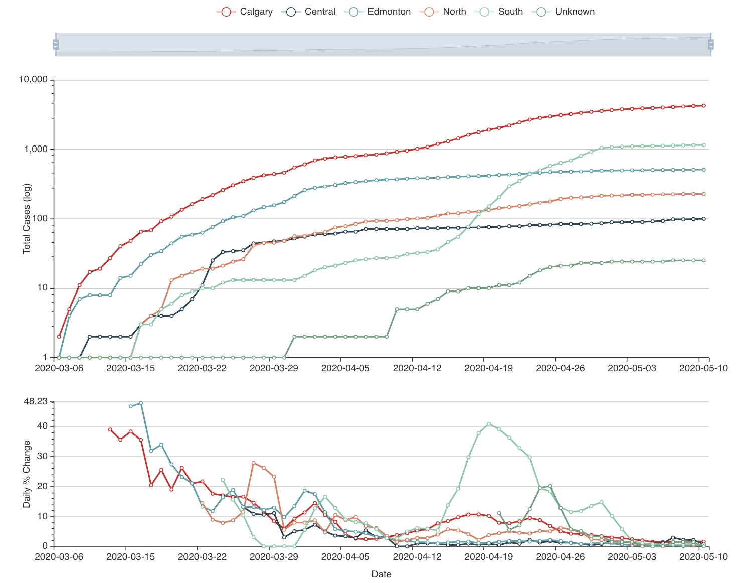
Driven by our own interest in looking at case counts close to our homes, we decided to drill down into the Alberta data utilizing the space-time information we have available for 132 local areas in the province. Alberta Health updates data regularly for case numbers, including active cases, recovered cases, and deaths. Because data were not always updated on weekends, we aggregated the data in weekly intervals.
Besides the cumulative case numbers, we also looked at incidences. Incidence is the case number standardized by the population size in the area, i.e. number of cases / 1000 individuals. We used the 2017 census data for this. We calculated the number of "new" cases that is the increase in the case numbers since the previous weekly interval.
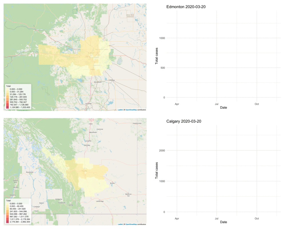
Using this information, we updated the interactive map that we had in the previous web app. The map is interlinked with the time series graph next to it which highlights the series if the spatial area selected in the map. The date can be picked on the slider that also allows autoplay by clicking the play button on the right-hand side of the slider.
The animation below illustrates the increase of the total number of COVID-19 cases in the Edmonton and Calgary health zones, the two highest population centres in the province, over the past nine months. The time series graph on the right shows the trajectory for the geographic areas within the two health zones:
Use the various controls in the app to:
- Select cumulative or new cases
- Show cases or incidences
- Look at the whole province or select individual health zones
- Display totals, or acive, recovered cases, or deaths
- Select the date for which the map should show the cases
- Use the autoplay option of the slider
- Hover and click the areas in the map to see the values in the popup
- Inspect interlinked time series plots on the right
- Hover ove the lines in the time series plot to see areas and case numbers
If you liked this interactive visualization, sign up for our newsletter below to get notifications about future updates. If you have complex data that you want to leverage, we can help! Schedule a free consultation to discuss how we can help. Visit our website to learn more our data science, and machine learning solutions.